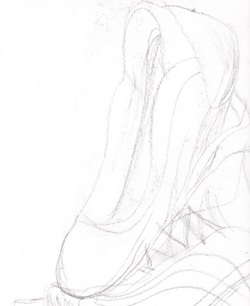
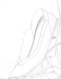
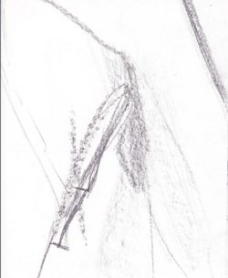
This was the quick sort of exercise we did in class. We had to draw something kind of abstractedly from what we saw in front of us i.e. brett and my shoes. I tried to use sloping and very swoopy lines to show this free flowing if you will as i charcoiled it. I'd much prefer actually drawing my style with nice details but that wasn't allowed and we basically only had 3 minutes a sketch. Personally i didn't like this assignment since i did not like the outcome of any of my drawings but i still
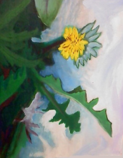
This painting took forever and in all honesty I hated every second of it. Why I took a picture of this and painted I can only blame on my need to be different from people who were just painting a flower. I tried to add and put a lot of layers of paint on my acrylic painting. I began with just the shapes and tried to get more and more detailed though i don't feel i did that good of a job most likely due to how I wasn't happy with it from the beginning. I will admit the best part though is probably the foliage in the back of the painting and the many variations and hues of greens I used along with a red to really make the leaves seem like they were coming out. The other thing I did well was the white clay behind it trying to show the blues and white milky laze to it instead of a boring paper like surface. It could have been much better but I never have been into planting plants anyway.
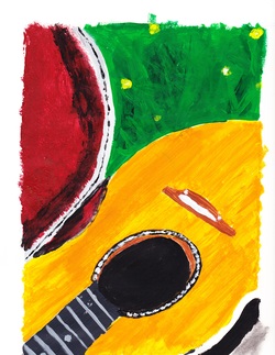
I was much happier and willing to paint this time around since I was very happy with what I was painting. I tried to use the grid system but in all honesty I gave up and just sketched it out like I always do (luckily i have a lot of practice drawing guitars). I copied a photo I had on my phone. As usual the weakest point was the foliage. I'm very lazy when it comes to painting leaves and or grass or trees. I tried to give it layers with different shades but that didn't turn out as well as I had hoped. The guitar in itself i think is beautiful. I feel i made it actually look like wood grain with the way I painted it and the other thing I was super pleased with would by the case in itself. I feel the red velvet and black layering I added definetly made it look and feel like that was realistic.
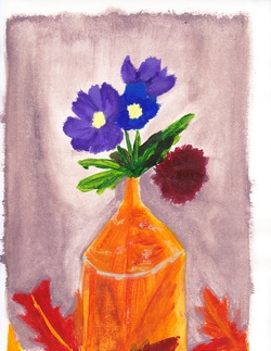
I was very excited to paint with acrylics, though by the end I will admit I wasn't nearly as excited or happy. Personally i hate painting/drawing/sketching/sculpting still life. =P I'd rather draw a nude person. Anyway Mrs. Heidman said this wasn't detailed enough in the least which i was pretty bummed about. I will admit the muffler copper can like object the flowers are in is poorly done I felt proud of the flowers themselves and my favorite thing, the background. I tried to apply a lot of different layers in my picture but could have done better on that especially. I also got lazy with the leaves as I always do.
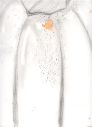
This drawing surprisingly was done with a charcoal pencil although you can't really tell after it was scanned. It was really to mostly practice shading and values within a picture. We tried to draw it as closely as we could to get in more details and larger areas of shading. Please ignore the paint splotch. That's from Johnny.
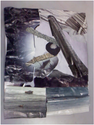
I accidentally deleted this piece a while ago so I am reentering it into my website. This was one of the first projects I did in art and it was a collage. I feel pretty good about it though I've never been one for collages. I liked the mood I put into the picture with the greys and blues along with the bottom of the picture I made sure to fold like a fan to give it an actual texture that also meets with its hues in the middle. The whole thing was suppose to show texture and so i crinkled up a few pieces and i folded the building in half so it came out of the page. The building being seen as a phallic be seen as a phallic symbol
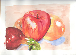
While painting this I started drawing hissy fits. I am not very good with water colors at all and didnt really know the basics of water colors and how apparently you're suppose to use white of the paper for it. After our teacher explained this to us I really had a hard time seeing how it would end up as I had no faith in my picture. I will say though in the end it's pretty good for a water color especially compared to the pygmy pumpkin below. I feel the depth is pretty good but the apple is slightly misconstrued on the right side of it. The blue shadows could also have been lighter.
This is a still life with a pygmy vice. I tried my best to portray shadowing but the scanner took away a lot of the fine shading I did on the figurine. I made sure to stay true to proportions but I could have fixed the hand.
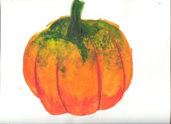
With the watercolors I mixed a lot of my watercolors to show the shading and values of the pumpkin. I aimed to show that the pumpkin's color changed across it and were darker in the shaded areas
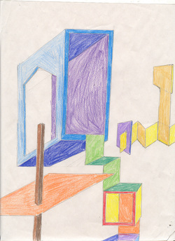
The concept of this piece was to practice giving depth to a picture. Although I preferred the image black and white I did color it to show where each wall was and where the lines stopped and such. I used the ruler and points to give it a better depth along with layering.